The Principles of Art - Balance, Harmony, Proportion, Emphasis, Rhythm and Unity
There are various principles to consider when making art which will help make your work pleasing to the eye... or the opposite if you want to break the rules and challenge the viewers!
BALANCE
Balance refers to the overall distribution of visual weight in a composition. A well-balanced composition feels comfortable to look at. Visual weight balances around an artwork’s axis. It may be vertical, in which visual elements balance on both sides of the axis, horizontal - in which they balance from top to bottom, or radial, where the visual elements balance like a wheel around a centre point.

Piet Mondrian - Composition II in Red Blue Yellow
The heavy lines around the smaller shapes add weight, creating balance between those and the red.
Each visual component of an artwork has visual weight, for example, darker colours outweigh lighter colours, patterned surfaces outweigh smooth, and brighter colours outweigh duller ones. Therefore, if you have a bright object in a composition, it will have significant visual ‘weight’ in your composition regardless of its size, versus a duller coloured object which will have less weight even if it is larger and closer.
PROPORTION
Proportion is all about the relationship of the size of one element compared to another. When drawing or painting realistically, proportion is very important to help convey relative sizes, distances and depth. If the proportions aren’t right, then the resulting drawing or painting will look odd.
However, artists can also use proportion for great effect. By manipulating proportion mindfully, the artist can add humour, quirkiness or a sense of menace to a composition.

The Proportions of the Human Figure (After Vitruvius), Leonardo Da Vinci, c.1492, pen and ink
HARMONY
Harmony uses the elements of art (colour, line, shape, form, value, space, texture) as a vehicle to create a sense of coherence and co-ordination amongst otherwise separate parts. For example, an artist may chose objects within their composition which have shapes that work well together, or colours that are in harmony with each other.

Clause Monet - The Water Lily Pond And Bridge
EMPHASIS
Just as a book normally has a main character or characters, as artists we need to draw our viewer’s attention to the parts of our painting that are important. We do this by giving the important parts of our painting ‘emphasis’. Where we want the viewer to look becomes our ‘focal point’.

Joaquín Sorolla, Research, 1897
We can create a focal point in different ways: using contrasting colours, by isolating the subject from the other elements to make it stand out. by locating it on the canvas where the eye is naturally drawn, or using ‘leading lines’ that draw the eye towards a certain area. (Be aware that putting your focal point in the very centre of your painting will prevent the viewer from looking at the rest of the image. Try to always put it off centre and arrange the other elements in a way that draws the eye towards your focal point.)
Remember that artworks can have multiple focal points. The degree to which the focal points stand out determines the order in which the viewer will notice them.
MOVEMENT & RYTHMN & REPETITION
Creating movement in an artwork gives it dynamism. There are a number of ways to add movement to your work, the most simple of which is to study what your subject looks like in motion and imply this movement using your drawing marks or brush strokes. Alternatively, you can use optical illusions that trick your eye into thinking something is moving (like the black & white op art created by Bridget Riley in the 1960’s), or use colour that creates a sense of dynamism, contrasting bright, deep colours with duller, paler ones. Rhythm in music is found by repeating a beat. Equally in visual art, repetition of a motif can create a rhythm which really brings an artwork to life. Remember that a slightly irregular rhythm appears more natural than a regular one.

Vincent Van Gogh - Starry Night
The Swirling brush strokes create a sense of movement and draw the eye.
UNITY
Unity is about the separate parts of an artwork working together as one. In order to create a unified composition, use one of these 3 methods: Simplicity, Repetition and Proximity. ‘Simplicity’ refers to the decision to reduce the amount of visual variety in order to create unity. For example, a simple pen and ink drawing is likely to exhibit some measure of unity due to the simplification of colours. ‘Repetition’ refers to the decision to repeat a motif or image more than once to create a sense of unity throughout the work. And ‘Proximity’ refers to putting various subjects close together within a composition in order to give the sense of oneness.
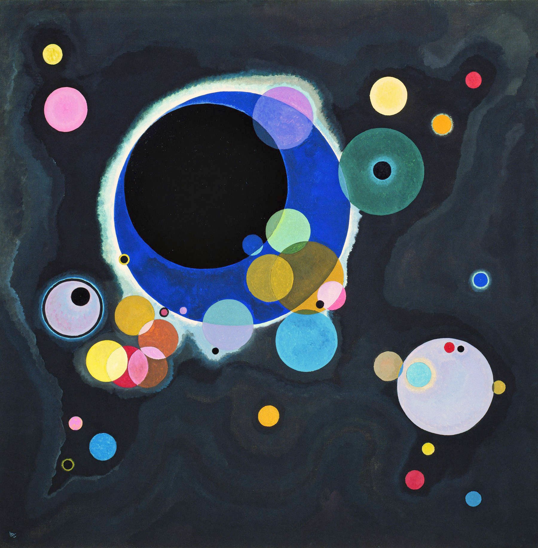
Vassily Kandinsky - Several Circles
Join us for our 10 week All-Abilities course and explore wide range of mediums and artistic styles. These art classes are suitable for all abilities, including complete beginners. We explore everything from architecture to portraits, using pencils, charcoal, pastels, watercolour, gouache and acrylics. We also run a wide variety of workshops, although they do sell out fast so sign up to our mailing list if you’d like to explore your creativity!